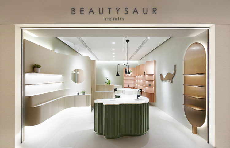

Text description provided by the architects. The Brief: A Novelty Flagship. Bean Buro was tasked with designing a flagship store for the organic skincare beauty brand Beautysaur Organics. The space is a 450sqft (42sqm) unit space in the new K11 MUSEA shopping mall in Tsim Sha Tsui of Hong Kong, by the developer New World Development. The brand has been highly successful with their online store, and the vision is to create a flagship store as a robust physical presence and attract a broader array of customers. The physical store would also allow the brand to organise events and workshops to introduce the latest skincare products to the general public.

The Process: Research by Creative Exploration. Our design process involved an initial immersion period to analyse the brand's existing online and in-store customer experience. We analysed the current and future demographics of targeted customer, as well as the peer to peer research of other competitor brands's store presence in Hong Kong Asia. Together with the client, we produced various studies to explore the ideal customer experience.

These resulted in new strategies for improved shopfront clarity, visual merchandising, and point of sales areas that are soft, friendly and welcoming for the customers. The Narrative: Eclectic Bodies. After forming a well-researched foundation and brief for the project, we proposed a poetic narrative that responded to the natural, 'primitive', and organic ethos of the brand. The dinosaur in the company logo represents primitive beings. The design concept is a spatial composition of 'eclectic bodies', a variety of custom-designed joinery units (inspired by body forms) that would serve different functions while working together cohesively.


The eclectic aesthetic uses curvy and voluptuous elements, with different materials and colours that would form a contrast with each other. The Solution: A Strategy for an Ideal Customer Experience. At first glance, the shopfront shows off a selection of hero products on a metal 'pill' shaped wall panel on one side. On the opposite wall is a light taupe coloured display unit, in a curved form that creates a funnelling effect to entice customers to explore the store offering inside.

In the centre of the open space is a bespoke island table designed with signature 'Bean' curves. It displays various featured products, a washing basin, and also a bar top with stools for customers to try on makeup products. A second bespoke island is located at the back of the store, for staff to provide demos to customers, or run workshop events. A coffee machine and drinks bar concealed in the timber joinery would open up for such events.

A quirky circular hole is punched through a curved display unit that provides a glimpse into a customer relaxation space, which is a cosy in-wall nook with leather seat and a terrazzo table, where up to a couple of customers could be served a cup of tea to relax. The Materials: Muted Colours + Soft Textures. Unlike the many neutral colour schemed skincare stores that are already on the market, the materials palette here is driven by a tasteful combination of soft colours such as taupes, beiges, and greens, with a limited use of terrazzo stones, timber and metal accents. The result is a bright, soothing and refreshing space that feels unique to the brand.


